Data Visualization with ggplot2

Leykun (MSc)1 & Yebelay (MSc)2

1NDMC, EPHI    2DMU & C4ED


April 28 – May 1, 2026

Module 3: Learning Objectives

By the end of this module you will be able to:

  • Explain the Grammar of Graphics and how ggplot2 implements it
  • Build plots layer by layer using ggplot() + geom_*()
  • Choose the right chart type for categorical, numerical, and time-series data
  • Customise titles, axes, colours, and themes
  • Create faceted plots to compare subgroups
  • Save publication-quality figures with ggsave()

Why ggplot2?

ggplot2 is built on a coherent Grammar of Graphics:

  • A plot = data + aesthetic mappings + geometric layers
  • Every component is explicit and modifiable
  • Consistent syntax across all chart types
  • Publication-quality output with minimal effort
Code
library(ggplot2)   # or loaded automatically with library(tidyverse)

Note

In public health: the same ggplot2 skills apply whether you’re mapping disease burden, plotting age pyramids, or presenting outbreak curves.

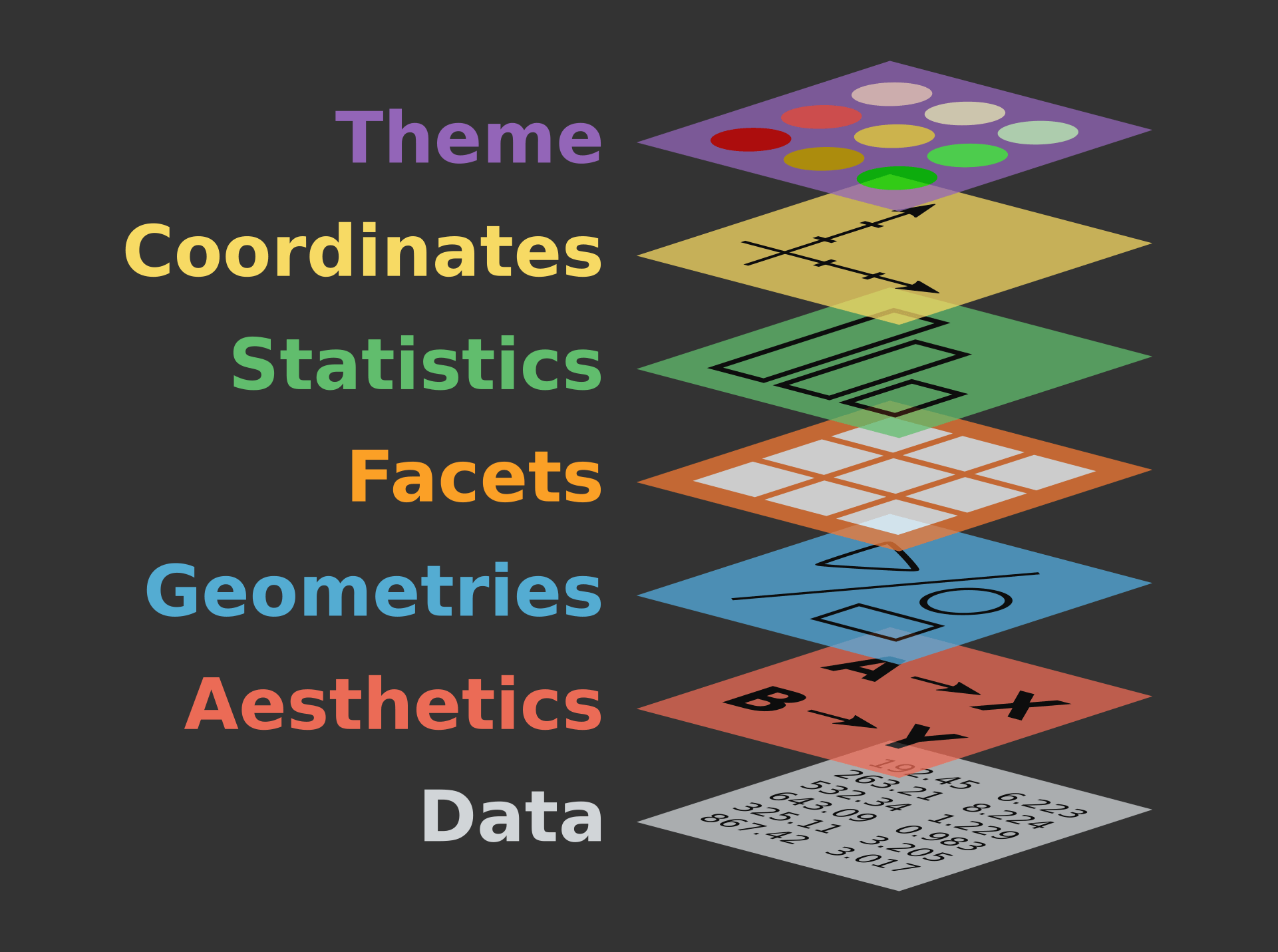
Components of the layered grammar

  • Data — raw dataset
  • Aesthetics — map variables to x, y, colour … (aes())
  • Geometries — shapes that draw the data (geom_*())
  • Facets — sub-plots by group (facet_wrap())
  • Statistics — computed summaries (stat_*())
  • Coordinates — axis system (coord_*())
  • Theme — fonts, grid, background (theme())

Common Aesthetic Mappings

Aesthetic What it controls
x, y Position on axes
colour Outline / point colour
fill Interior fill colour
size Size of points / lines
shape Point shape (0–24)
alpha Transparency (0 = invisible, 1 = opaque)
linetype Solid, dashed, dotted, etc.

Geometries (geom_*()) function

The general syntax is:

  • ggplot(data = data, mapping = aes(mapings))+ geom_function()

  • Geom Components

    Geom Description Input
    geom_histogram Histograms Continous x
    geom_bar Bar plot with frequncies Discrete x
    geom_point Points/scattorplots Discrete/continuous x and y
    geom_boxplot Box plot Disc. x and cont. y
    geom_smooth Adds a smoothed conditional mean / regression line Continuous x and y
    geom_line Line plots Discrete/continuous x and y
    geom_abline Reference line intercept and slope value
    geom_hline, geom_vline Horizontal and vertical reference lines yintercept or xintercept

The ggplot2 Template

Every ggplot follows this pattern:

Code
ggplot(data = <DATA>, mapping = aes(<MAPPINGS>)) +
  <GEOM_FUNCTION>() +
  <OPTIONAL LAYERS>

The three required components:

Component Function Example
Data The data frame data = penguins
Aesthetic Map variables to visual properties aes(x = species, y = body_mass_g)
Geometry The type of plot geom_boxplot()

Building a Plot Layer by Layer

We use the penguins dataset (Palmer Archipelago, Antarctica) as a familiar reference before applying skills to surveillance data.

Code
library(ggplot2)
library(palmerpenguins)
ggplot(data = penguins)

Code
ggplot(data = penguins,
       aes(x = bill_length_mm, y = bill_depth_mm))

Code
ggplot(data = penguins,
       aes(x = bill_length_mm, y = bill_depth_mm)) +
  geom_point()

Code
ggplot(data = penguins,
       aes(x = bill_length_mm, y = bill_depth_mm,
           colour = species)) +
  geom_point(alpha = 0.7) +
  theme_minimal()

Part 1: Visualising Categorical Variables

Bar Chart with geom_bar()
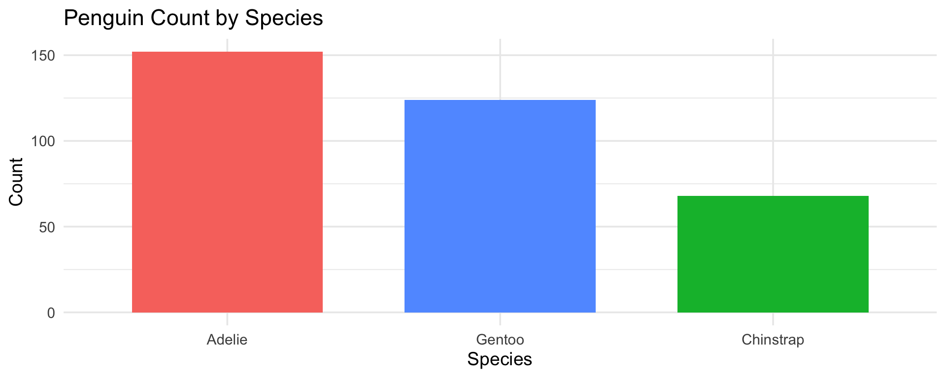
Code
ggplot(penguins, aes(x = fct_infreq(species), fill = species)) +
  geom_bar(show.legend = FALSE, width = 0.7) +
  labs(title = "Penguin Count by Species",
       x = "Species", y = "Count") +
  theme_minimal(base_size = 14)

Tip

fct_infreq() orders bars by frequency — always more informative than alphabetical ordering.

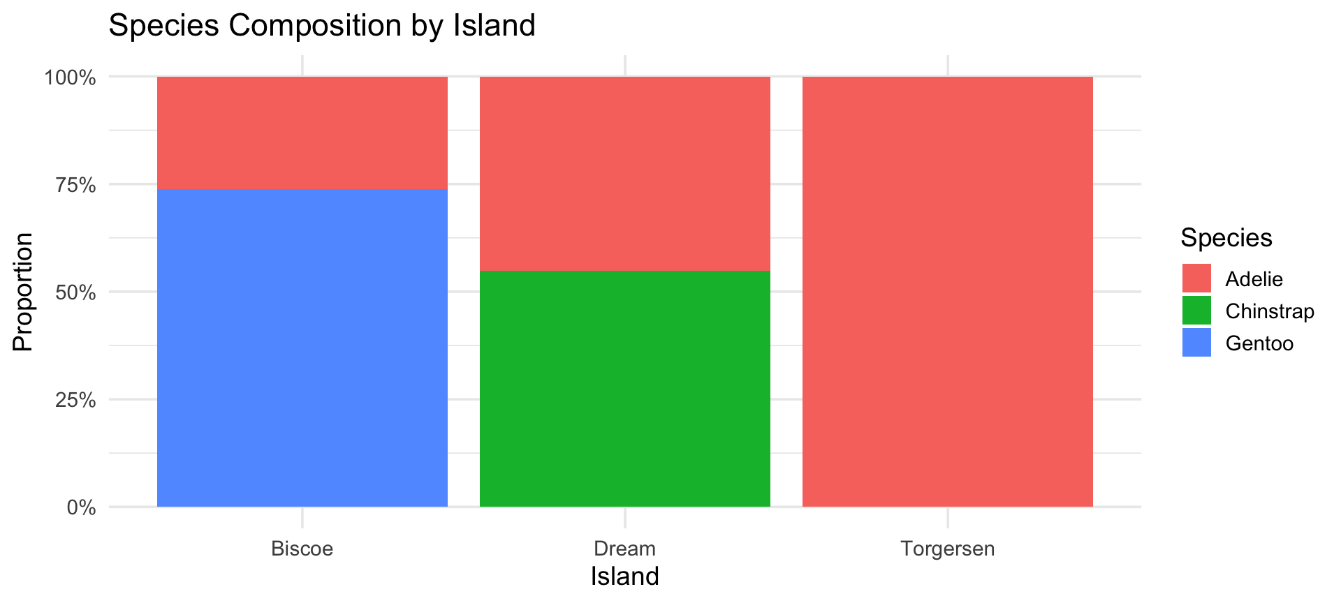
Stacked Bar Chart — Two Categorical Variables

Code
ggplot(penguins, aes(x = island, fill = species)) +
  geom_bar(position = "fill") +   # position = "fill" shows proportions
  scale_y_continuous(labels = percent_format()) +
  labs(title = "Species Composition by Island",
       x = "Island", y = "Proportion", fill = "Species") +
  theme_minimal(base_size = 14)

Part 2: Visualising Numerical Variables

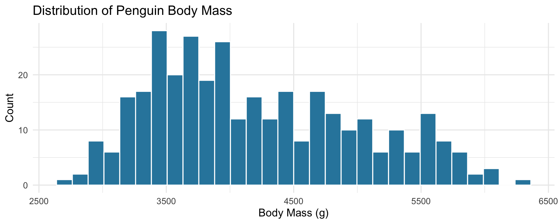
Histogram with geom_histogram()

Code
ggplot(penguins, aes(x = body_mass_g)) +
  geom_histogram(bins = 30, fill = "#2E86AB", colour = "white") +
  labs(title = "Distribution of Penguin Body Mass",
       x = "Body Mass (g)", y = "Count") +
  theme_minimal(base_size = 14)

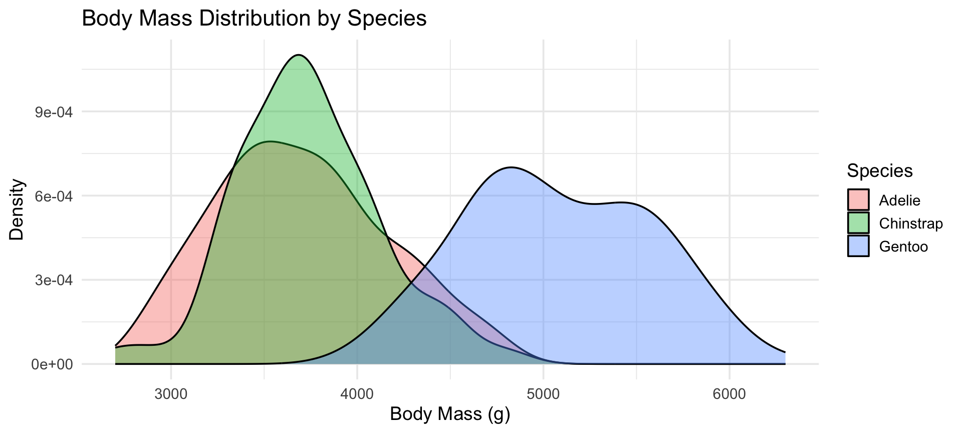
Density Plot — Comparing Groups

Code
ggplot(penguins, aes(x = body_mass_g, fill = species)) +
  geom_density(alpha = 0.4) +
  labs(title = "Body Mass Distribution by Species",
       x = "Body Mass (g)", y = "Density",
       fill = "Species") +
  theme_minimal(base_size = 14)

Tip

Density plots are ideal for comparing distributions when group sizes differ — common in age-stratified epidemiology.

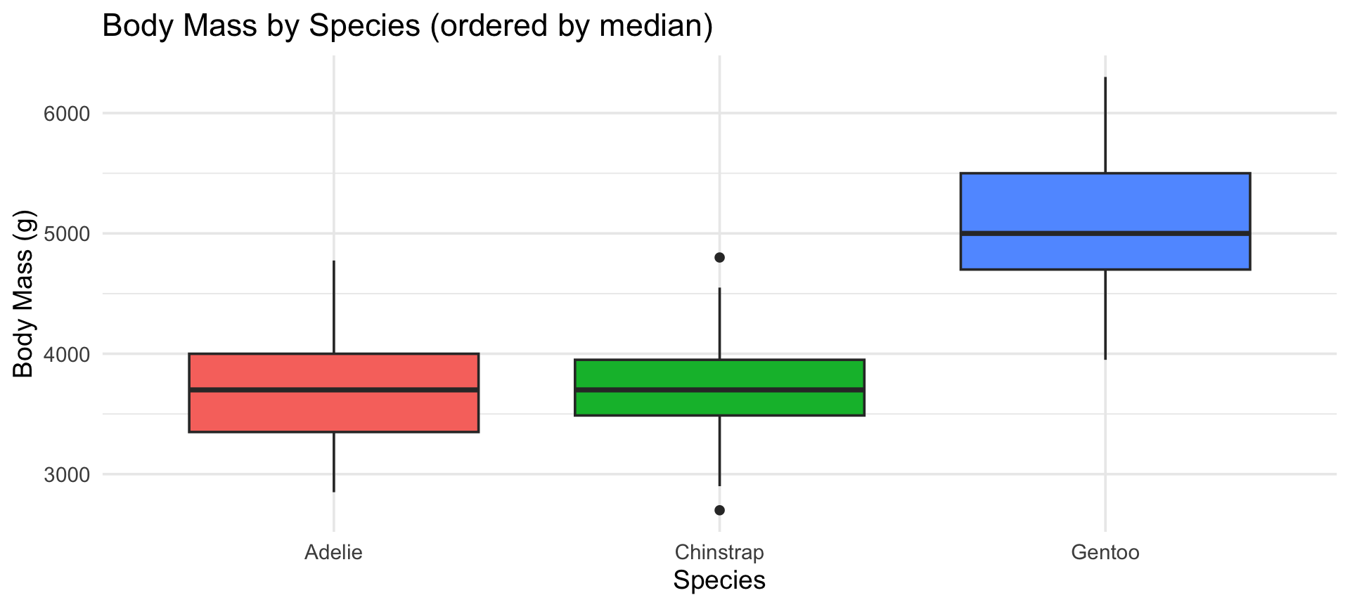
Boxplot — Distribution Across Categories

Code
ggplot(penguins,
       aes(x = species,
           y = body_mass_g, fill = species)) +
  geom_boxplot(show.legend = FALSE) +
  labs(title = "Body Mass by Species (ordered by median)",
       x = "Species", y = "Body Mass (g)") +
  theme_minimal(base_size = 14)

Part 3: Relationships Between Variables

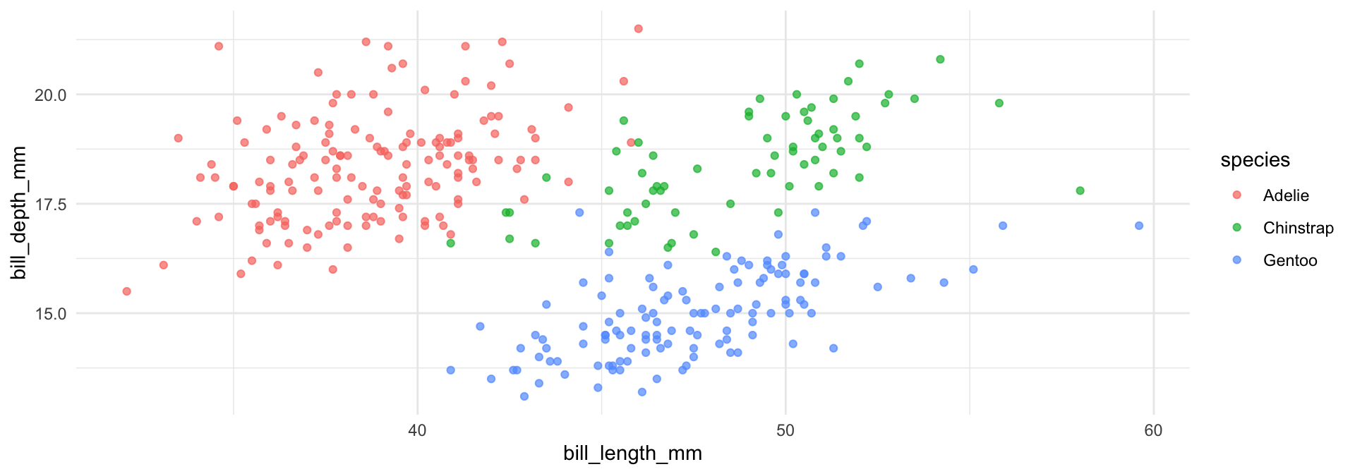
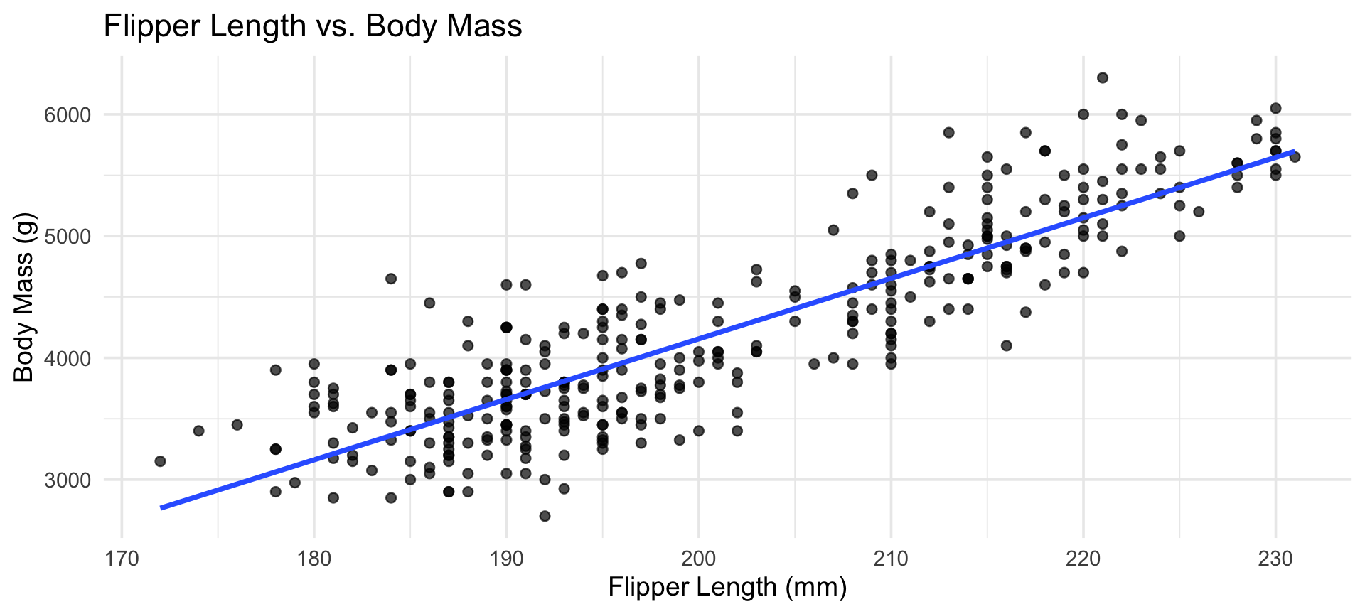
Scatter Plot with Regression Line

Code
ggplot(penguins,
       aes(x = flipper_length_mm, y = body_mass_g)) +
  geom_point(alpha = 0.7, size = 2) +
  geom_smooth(method = "lm", se = FALSE) +
  labs(title = "Flipper Length vs. Body Mass",
       x = "Flipper Length (mm)", y = "Body Mass (g)",
       colour = "Species") +
  theme_minimal(base_size = 14)

Facets — Small Multiples

Facets create a separate panel for each level of a grouping variable.

Code
ggplot(penguins,
       aes(x = flipper_length_mm, y = body_mass_g,
           colour = species)) +
  geom_point(alpha = 0.7) +
  facet_wrap(~species) +
  labs(title = "Flipper Length vs. Body Mass by Island",
       x = "Flipper Length (mm)", y = "Body Mass (g)") +
  theme_minimal(base_size = 13) +
  theme(legend.position = "bottom")
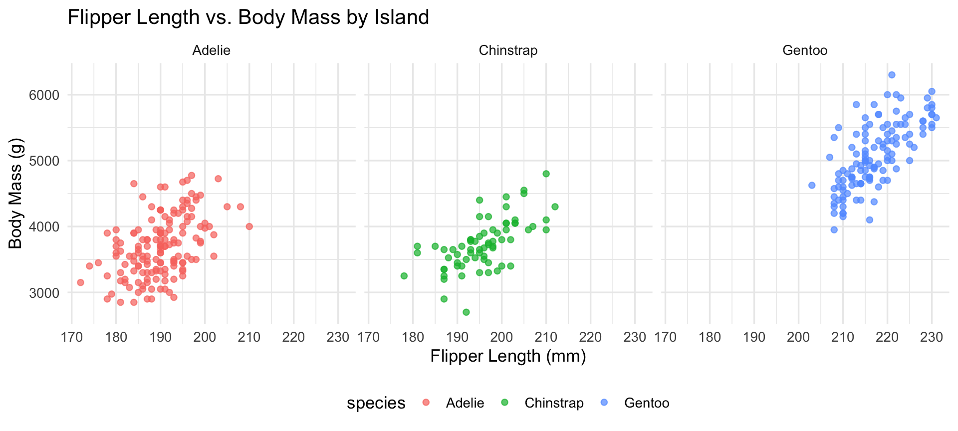
Part 4: Time Series

Code
# Using measles data
measles_ts_data <- read_csv("data/measles_ts_data.csv", show_col_types = FALSE)
measles_ts_data |>
  ggplot(aes(x = date, y = measles_total)) +
  geom_line(color = "steelblue", linewidth = 0.9) +
  geom_point(color = "steelblue", size = 0.6) +
  labs(title = "Monthly Measles Cases (2012-2024)",
       x = "Date", y = "Total cases (monthly)") +
  scale_x_date(date_breaks = "2 year", date_labels = "%Y") +    
  theme_minimal(base_size = 14)

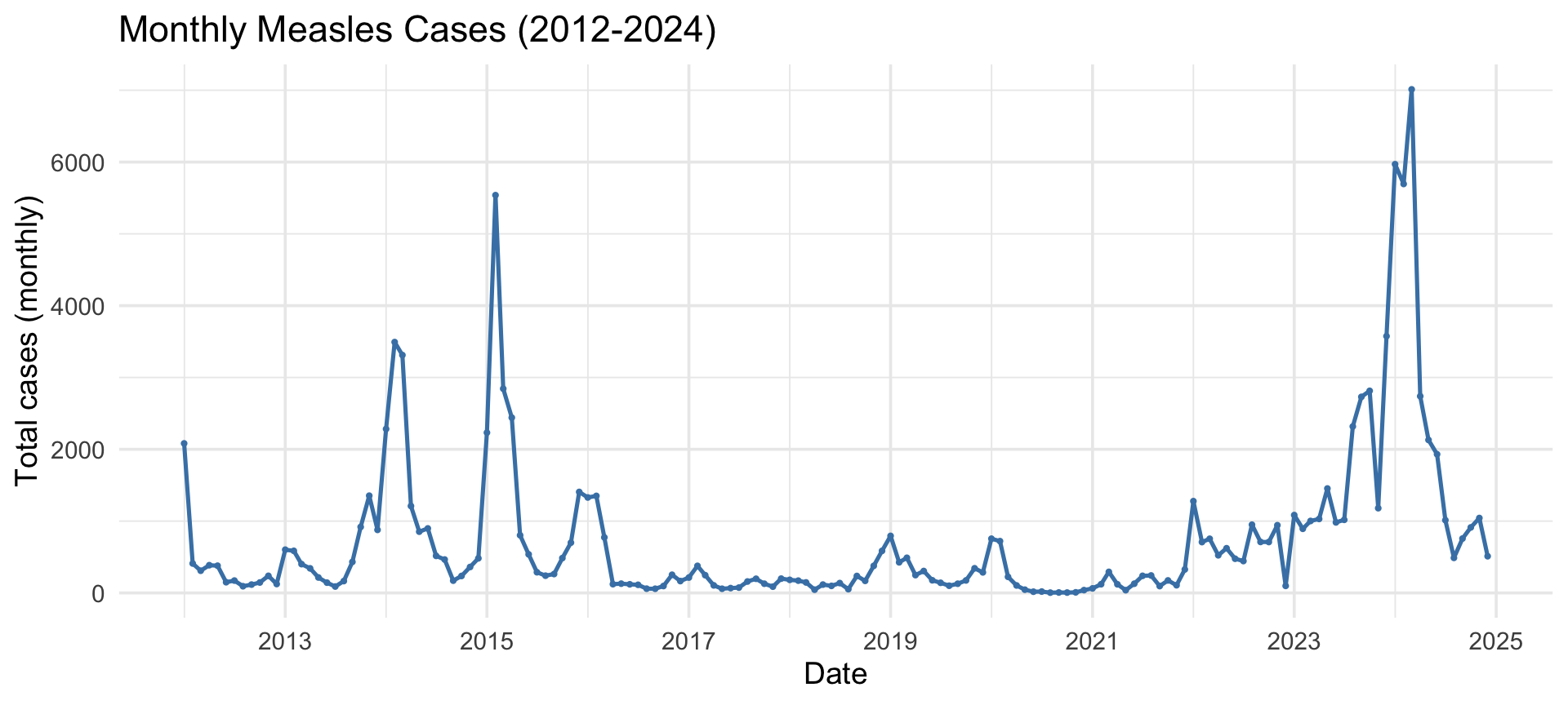
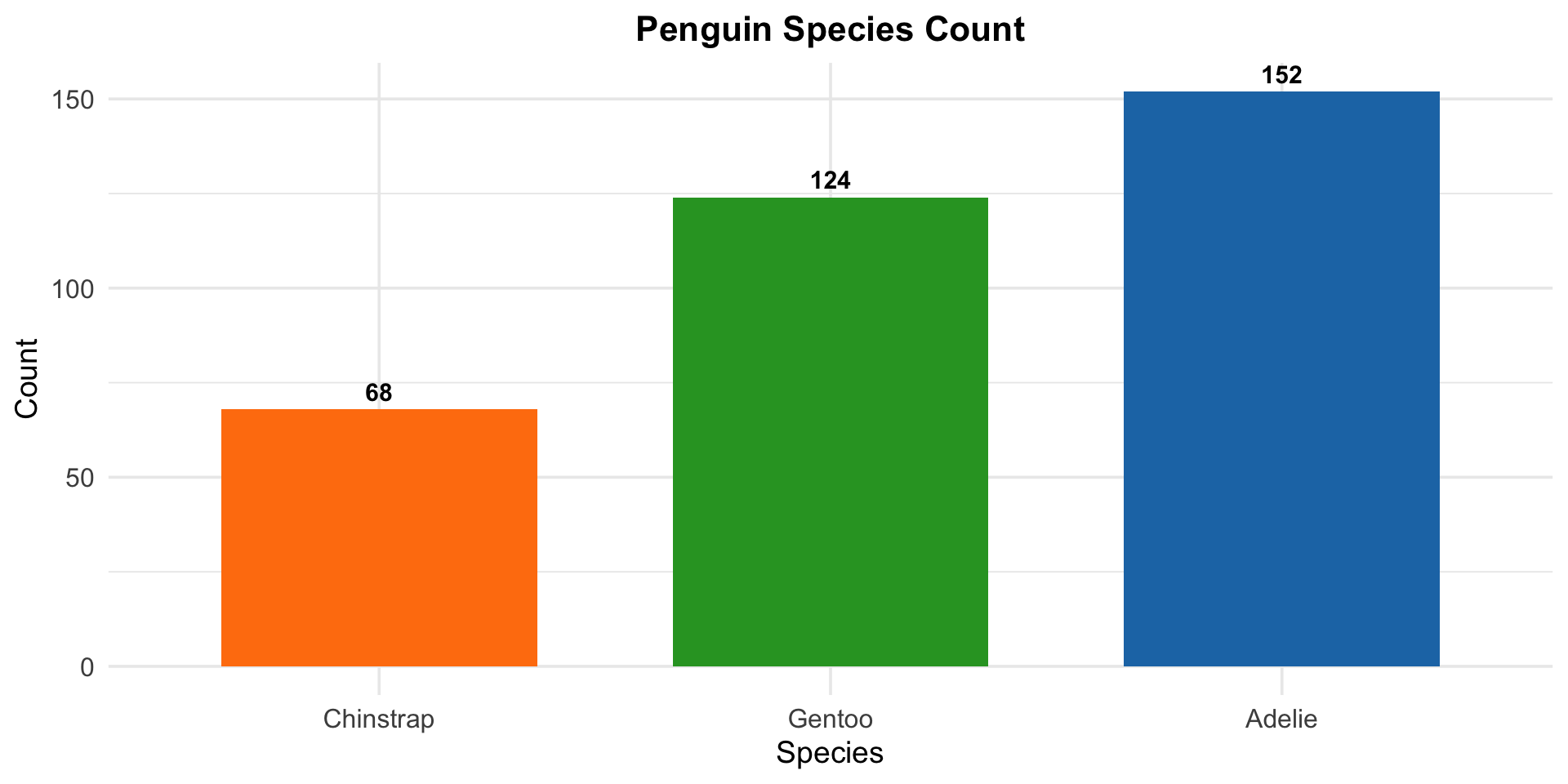
Customising Your Plot

Key theme() elements for polished slides and reports:

Code
ggplot(penguins, aes(x = fct_rev(fct_infreq(species)), fill = species)) +
  geom_bar(show.legend = FALSE, width =0.7) +
  geom_text(stat = "count",
            aes(label = after_stat(count)),
            vjust = -0.5, fontface = "bold", size = 4) +
  labs(title = "Penguin Species Count",
       x = "Species", y = "Count") +
  scale_fill_manual(
    values = c("Adelie" = "#1f77b4", "Chinstrap" = "#ff7f0e",
               "Gentoo" = "#2ca02c")) +
  theme_minimal(base_size = 14) +
  theme(
    plot.title = element_text(face = "bold", hjust = 0.5, size = 16),
    axis.text  = element_text(size = 12)
  )

Saving Plots with ggsave()

Code
# Assign your plot to an object
my_plot <- ggplot(penguins,
                  aes(x = flipper_length_mm, y = body_mass_g,
                      colour = species)) +
  geom_point() +
  theme_minimal()

# Save it
ggsave(
  filename = "figures/penguin_scatter.png",
  plot     = my_plot,
  width    = 8,
  height   = 5,
  dpi      = 300   # 300 dpi for publication quality
)

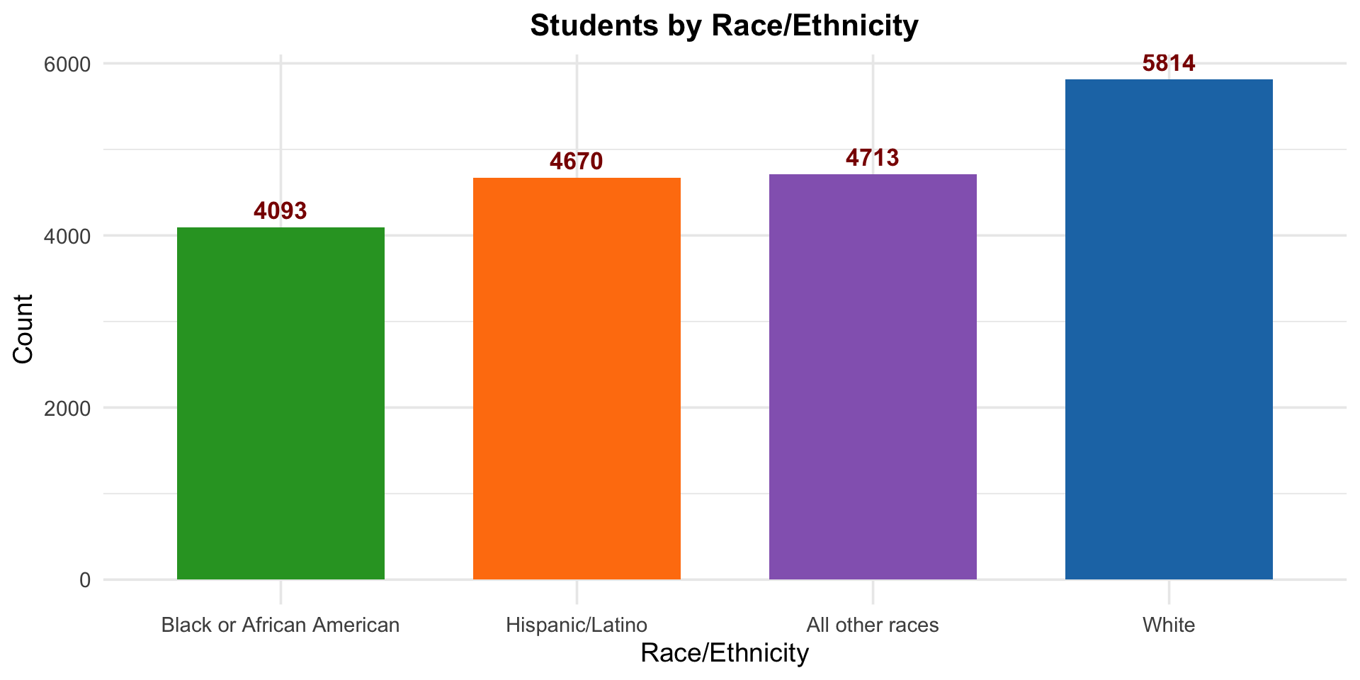
Exercise 1 — Customised Bar Chart

Task: Create a customised bar chart showing the count of students by race/ethnicity (race4).

Requirements:

  1. Remove missing values from race4 before plotting.
  2. Order categories by frequency, most frequent on the right.
  3. Add the count as a bold, dark-red label above each bar.
  4. Use custom fill colours as shown in the figure.
  5. Center and bold the plot title.
  6. Use theme_minimal() with increased base font size.

Exercise 2 — Zero-Dose by Region

Using measles_clean (from Module 2):

  1. Calculate zero-dose prevalence (%) for each region
  2. Create a horizontal bar chart ordered highest to lowest
  3. Add percentage labels to the right of each bar
  4. Use fill colour #D62828
  5. Add a title, subtitle, and axis labels using labs()

Module 3 Summary

ggplot2 builds plots layer by layer: data → aesthetics → geometry
Chart selection depends on variable type (categorical, numerical, time)
facet_wrap() creates small multiples for group comparison
theme() gives full control over plot appearance
ggsave() saves print-ready figures at 300 dpi
ggplotly() converts any ggplot to an interactive visualisation

Resources